bare market
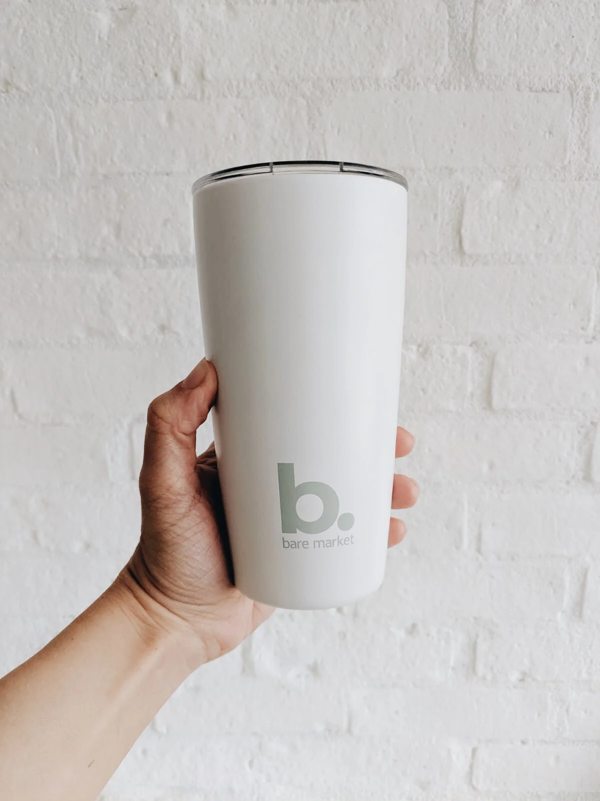
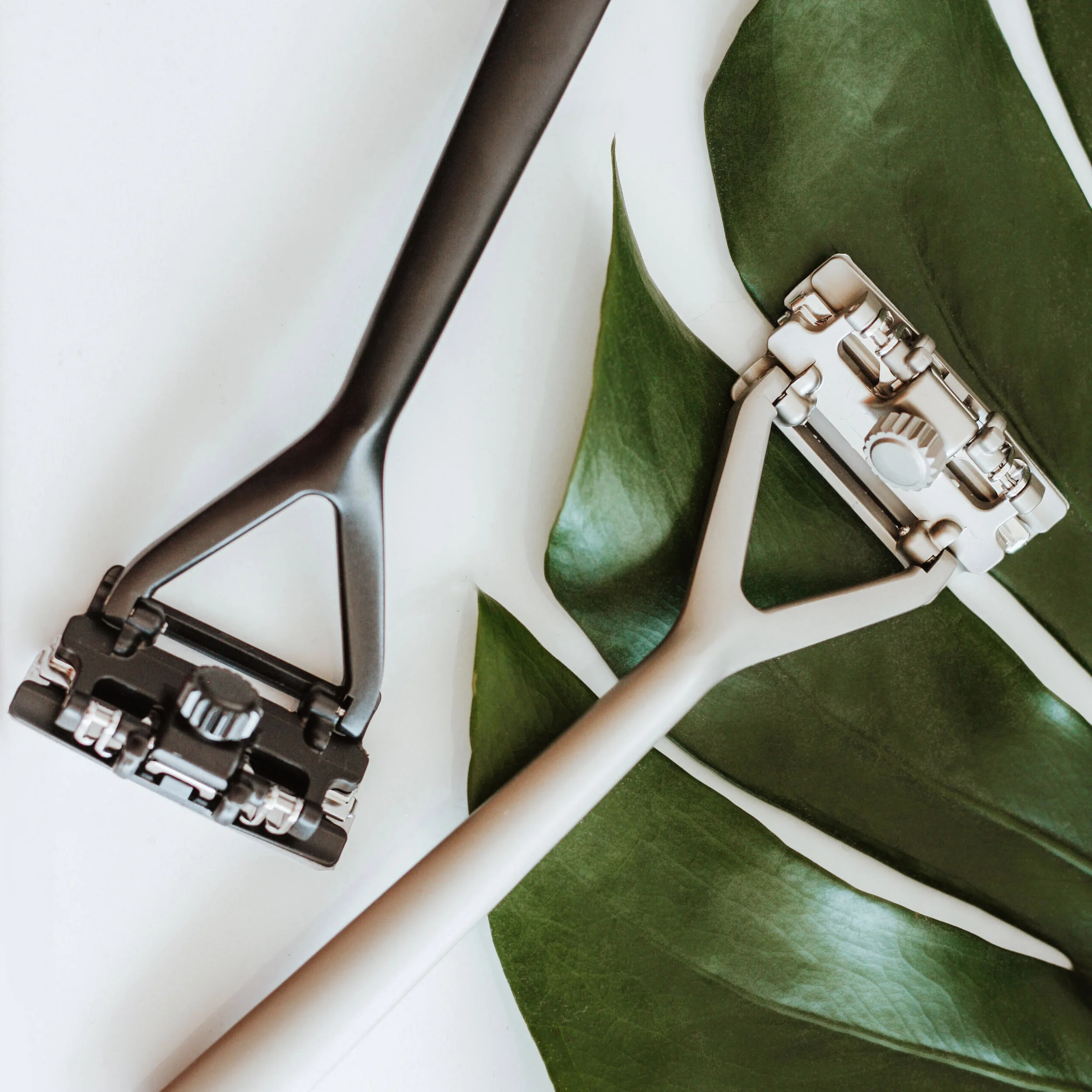
With an interest in reducing my environmental footprint and supporting a like-minded business, I teamed up with bare market (a package-free grocery & goods retailer) as a creative / experience lead. My main role was to help them develop a brand identity and consumer experience that would appeal to their target audience while standing out from competitors. I oversaw the design of the visual identity & branding, designed the website & in-store print signage, consulted on the interior design of the store, developed a photography style guide for lifestyle and product imagery, and created social media content while managing a team of freelance creatives.
VISUAL IDENTITY & BRANDING CREATIVE / Experience LEAD
To support the offering of a simple, plastic-free lifestyle, we commissioned designer Dora Tanasoiu, to develop a minimalistic logo and collection of iconography that would reflect the uncomplicated products and accessible consumer experience bare market provides. The colour palette draws inspiration from the natural world (air, water, earth, sun), and the colour-blocked graphics intentionally incorporate bare minimum details.

WEB & PRINT DESIGN CREATIVE / Experience LEAD
When designing the website, I used a full-screen, minimalistic, layered approach. The goal was to provide a simplified, informative, and intuitive shopper experience while working with a templated Shopify site that would be easy for bare market employees to update and manage long-term. Similarly, in-store signage using straightforward iconography was developed to guide the customer experience and act as a conversation-starter for shoppers new to the “bring your own container” system.
INTERIOR DESIGN CREATIVE CONSULTANT
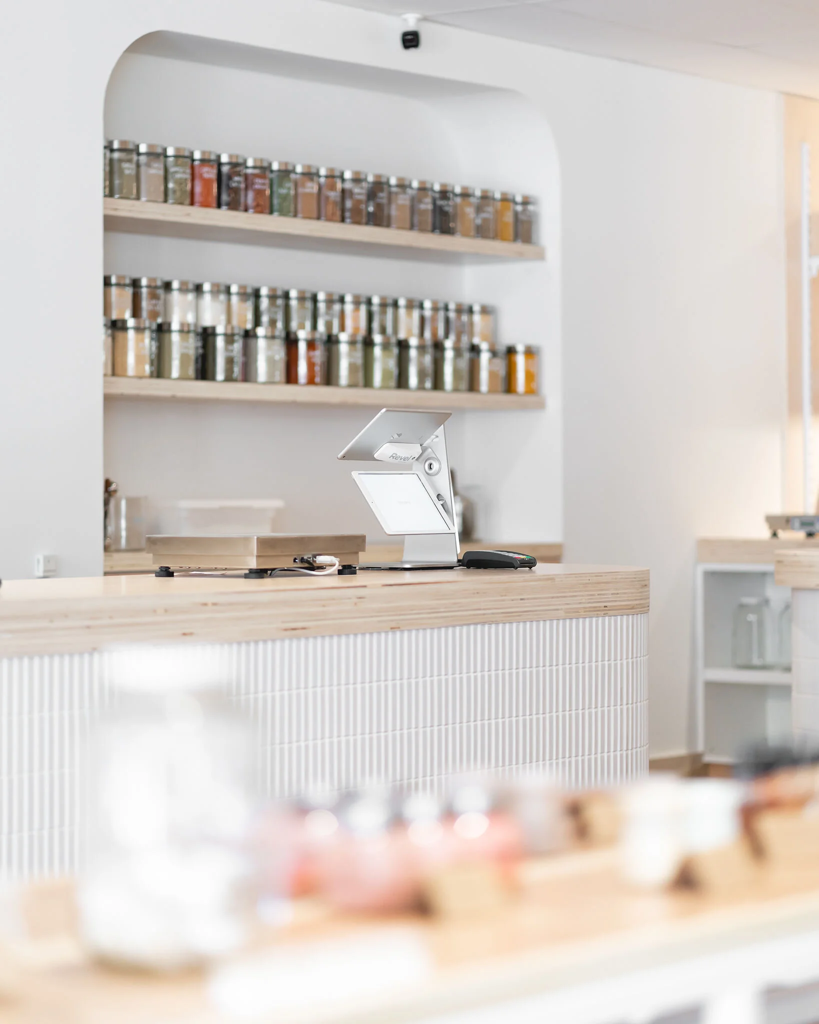
As interior designer, Natasha Popek-Konieczko of Common Good Studio, developed the vision for bare market’s first brick-and-mortar location, I provided creative consultation to ensure the physical store environment would complement the rest of the visual identity and aesthetic we had created for the brand. To make a shop that is as easy to navigate as it is beautiful, we used clean lines, sustainable materials, refurbished fixtures, and hints of bare market’s colour palette, while leaning into the naturally bright and open qualities of the space.
Photo by @JakeGrahamPhoto and @MeganGloverPhoto
Photo by @JakeGrahamPhoto and @MeganGloverPhoto
Photo by @JakeGrahamPhoto and @MeganGloverPhoto


